On the Internet there are some techniques designed to get users to perform certain actions, they are called CTA (Call to Action).
When we talk about an online store, a blog or any type of website in general , the most important thing for them is to increase their conversions. And these can be: subscriptions to a list, purchase of products, content download or any other action that helps us improve the results of our strategies.
The million dollar question you are asking yourself is: How can we get a reaction in our visitors? In digital marketing, for a long time, different methods focused on responding to this need have been investigated and perfected. But, now let’s start by defining a Call to action.
What is A Call To Action (CTA) and What is It For?
A Call to Action (CTA) is a word, phrase or button that motivates users to take the next step: “Buy Now”, “Read more”, “Subscribe”, “Register”, etc. Its objective is to attract potential clients and convert them into leads or final clients.

And to make good use of them you have to pay attention to how to design them , where to put them and what words, colors and shapes we are going to use to persuade them and achieve that they fulfill our objective.
Analytics, trial and error and active listening in communication with our audience should be some of the bases of the pyramid when designing the strategy for our Call to action.
Remember that what we are looking for with a CTA is to make the user buy, connect with us, visit our site or download some relevant content. And for this it is very important to segment our target audience well , since, based on it, we will design one Call to Action or another.
There are people and businesses that do not use CTAs because they do not want to give a commercial touch to their page or they do not want to be so direct. For whatever reason, they are falling into error, since a call to action is nothing more than directing the user according to our objectives.
Of course, we must know how to guide him on this path so that he ends up acting in the appropriate way and that is closest to our interests.
How To Design More Attractive Call to Action?

When designing a CTA there are several aspects that you should take into account so that this call to action works and avoid the call to action that scare users in the form of advertising or with a design that leaves much to be desired.
Therefore, we should look at the following:
► Call To Action: Target Audience
Identify your target customer and based on that design a call to action directed for visitors, leads or clients. For example, for visitors the CTA must be striking, since the public does not yet know you, but needs ideas and content. So why not offer a gift (ebook, manual or valuable content) in exchange for subscribing.
For leads , this type of user already knows what they want and therefore you have to offer them a little more value and convince them that your content is the best . It should be a message that meets a specific need of the potential client and that expresses the benefits that you will get when that document is downloaded, for example.
The CTA for clients contains a nearby message. The client is prepared to make you an irresistible offer.
► Message According To Your Style
Design is important, but we must not forget what we want to communicate. What good is a nice call to action if you don’t clearly state what we want to convey to the client? Try to keep the right tone depending on the characteristics of your target.
Some Tips To Design The Text:
- Use a descriptive and powerful headline phrase that summarizes the product or service
- Put a subtitle that arouses even more interest from the previous sentence
- Write a short paragraph that exposes the benefits and advantages of the product.
- Specify what specific action you want the client to take: you want them to try a demo, register or make a reservation.
- Put an urgency on them to act quickly. For example, use expressions like: “now”, “now”, “try it in 30 days”. In this way, the client will act immediately.

► Indicates The Action Clearly
You must indicate what you want the user to do. Usually imperatives of the type are used: Follow us, sign up or subscribe.
If you do not specify it, the user will not know what to do and your objectives will not be met.
► Includes Numbers That Make The Difference
It is very common to use numbers, which show exactly what the user is going to achieve.
For example, a reduction of the previous price or as in the previous examples of Ryanair and Women’s Secret, which appeal to the action using special offers.
► An Attractive Design
Create a design that differs from the rest of the page to highlight the CTA and that the user easily identifies.
When I say highlight, I do not mean to put it in a phosphor color, it should not be overdone either.
It must have a visual coherence with the rest of the page and to achieve that coherence you must use the same brand colors and the same typography.
Play with the font size and use if you have images or graphics of the product you want to sell.
► Place It in The Right Place
I’m sure no one likes to walk into a physical store when an employee is harassing you with a product they don’t even know about. True? Well the same thing happens in an online store.
Burdening the user to buy a product that you are promoting is a bad technique. This can create a tense environment among clients.
NOTE: The ideal would be to first offer what the customer is looking for and then make an offer of another complementary product to that.
A good place to place it is after an article or in the side column (sidebar), although this is relative on each website.
Other Relevant Issues in a CTA
The copy ( copywriting ) or the words that appear within our call to action are those that invite the user to carry out this action.
Therefore, it is vitally important that when you design the CTA word, question or button, you specifically explain what will happen when the user clicks.

This will prevent the user from thinking and will generate more conversions.
The time of users on our website is a precious asset and that is why we must give the user everything done.
When Choosing To Copy, Two Things Must Be Kept In Mind:
- Avoid words that specify an action that users precisely do not want to perform . For example: buy, register, download …
Put yourself in the minds of your potential customers and you will know that they do not want to buy anything, they want the benefit of buying that specific product. Saying “download” is not the same as “get this free ebook.”
- It is recommended to use the first person singular in the copy as this conveys ownership .
For example, instead of using “participate”, we can use “I want to participate” or “sign up”. Thus, they will feel more motivated to get that profit.
The buttons have to stand out from the content to get the visitor’s attention. One of the most used techniques for this is to use a color that contrasts with the other colors used.

It is convenient to leave blank space around the button, so we will be able to attract the user’s attention.
Many times we tend to fill in and we don’t realize that we overload everything. Ideally, leave a normal margin between text, images, and buttons.
»You may be interested to see: What is Digital Marketing or Online Marketing? Find Out How To Boost Your Brand With This Strategy
Different Real Examples Of Calls To Action On The Internet «CTA»
Let’s now look at 8 CTA examples that really work:
1) Ryanair
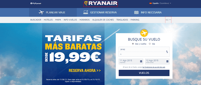
Ryanair uses numbers , in this case an offer, to capture the user’s visual attention.
With a simple message and a CTA button that calls the user to perform the action and: “Reserva Ahora”.
In addition, Ryanair also uses its corporate colors and different types of sizes.
2) Popupsmart

In our case, popupsmart has programmed the pop-up to exit after 10 seconds with popup builder when the user clicks on an article to read it. The call to action offers valuable information for those who subscribe.
»You may be interested to see: A better popup builder.
3) Women ‘secret
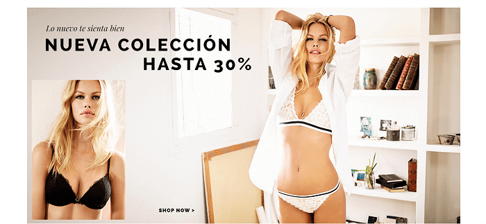
Women’secret uses the image of a model as the main resource in the call to action.
Play with the font size, discounts and use a direct message: “Shop now” .
4) Pizza Hut

Pizza Hut has chosen to create a button next to the menu, as if it were part of it. His message is striking, along with the image of the pizza.
5) Atres player
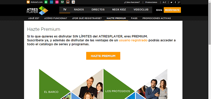
Sometimes it is useful to create an extra to encourage users to complete a call to action.
They can be discounts, contests or offer the user a Premium service, explaining in the same space the advantages to the user when making the subscription.
6) Cola Cao
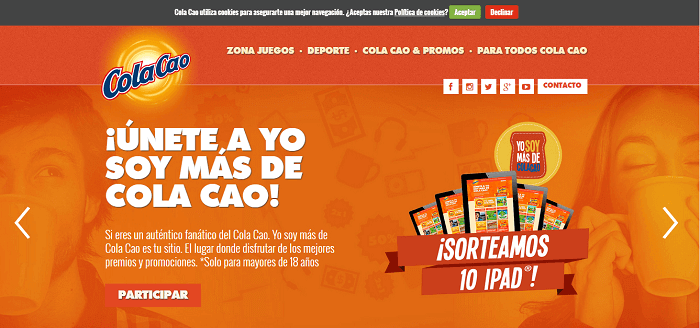
ColaCao creates a contest for users to subscribe.
Use a large headline and an introduction that explains the benefits of being from the ColaCao community.
This time he has opted for a simple copy (phrase or word that appears inside the button): “Participate”, along with an image of the prize that undoubtedly appeals to the user.
7) Heineken
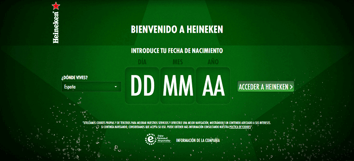
In this particular case, the place may interest Heineken to assess where to hold their next events.
And the age of the visitors to know what age ranges usually visit the web and thus, direct their communication better in the online environment.
8) WiX
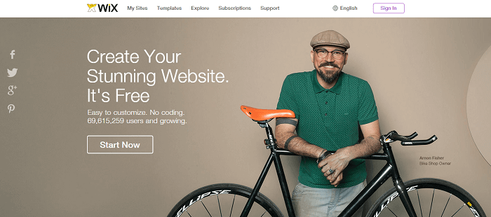
If you look at Wix, the call to action takes up a large part of the page .
It uses different letter sizes, numbers to refer to the number of registered users and to give confidence to visitors.
But what strikes us the most is that he uses his own clients as a visual resource, who have been satisfied with his service.
What Are The Mistakes You Should Avoid When Using A CTA On Your Website?
Main ERRORS that we should avoid when creating our Call to Action.
-
Put Together Several Calls To Action:
Inserting numerous CTAs often confuses readers.
The first thing we must do is define the main objective. What is the main action that we seek to generate in the public?
For example, a publication can call to fill out a form, but if we are in an online store, at the same time it can invite to make a purchase or contact the seller.
Let’s not mix objectives and let’s focus on the main one.
Includes only l a s CTA s who are you relate to s the first objective, without diverting attention to other secondary issues.

-
Do Not Make The Phrase Or Button Visible:
It may happen that having a certain design, with a button that stands out little from the rest, the reader does not appreciate the CTA.
Do not wait for the user to discover it by hovering over it and change it!
-
Do Not Add Discounts, Promotions Or Free Downloads:
We all like to know that we will receive something extra for taking a certain action. Take the opportunity to give something away: a course, a discount, an ebook, a template , anything that adds value to your readers!
-
Don’t Try New Locations:
As I said previously, it is recommended to place the CTAs on the side or at the end of each post.
However, some experts claim that most readers do not get to read the full text, so we should try new sites before the end of the article.
It would be a good option to try different locations and make comparisons of which one worked best and why. Test the results, don’t be afraid of change!
-
Link The CTA To The Home Page:
It is very common for companies to redirect the links of the CTAs buttons to the home page of their website. This is a big mistake, since each button must be associated with a suitable landing page , that is, with the CTA’s proposal.
That is, if we are promoting a product, we must redirect to the online store with the product already displayed, or if we want to contact the seller we must redirect to a contact form and not to the home page.

Source: josefacchin.com/cta-llamadas-a-la-accion


